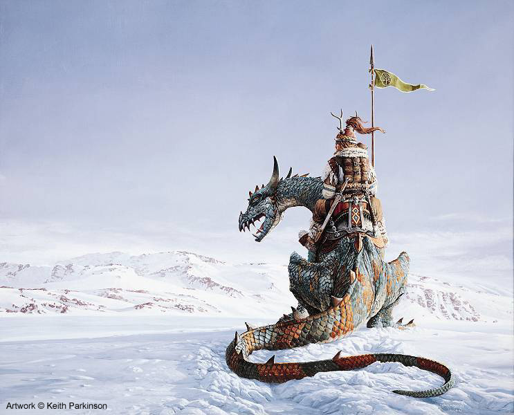
After yesterday's health stuff, I figured I better get this blog back on track with some good geekery.
A friend of mine has been bitten by the OSR Bug, and has decided to run a 1st Edition AD&D game for his birthday in April. And I am TOTALLY jazzed about it! I'm playing what I always play (the hulking warrior), but with 1E flair. Been persuing my old AD&D books in preparation already.
And AD&D books are somewhat related to something that has been on my mind today, and something I have touched on before: Artwork.
So, when you look at some of the work done by guys like Jeff Dee and Erol Otis...well, they don't always measure up. However, in recent months I have come to a greater appreciation for the "imperfect" illustrations in those old books. They had style and expressiveness in spades, and really captured a specific feel that I have come to associate with AD&D.
As you can imagine if you have read even half of my blog, I am a creature of nostalgia. It dictates many of my likes and dislikes. So, while I understand some of the weaknesses in the old gaming art, there is a certain amount of nostalgic charm that is lost these days.
With 3rd Edition, the artwork of D&D books was raised to a much higher level. Full-color illustrations by Wayne Reynolds form the standard in my mind. And I absolutely LOVE his art. As I did many of the older cover artists (who occasionally did interiors as well), like Jeff Easley and Larry Elmore. But the style is very different. It's very dark and gritty, and, well, for lack of a better word, "pointy." I miss the soft and dangerous lines of Larry Elmore.
Does that make any sense?
But, even when you consider Elmore, Easley, Clive Cladwell, and Keith Parkinson, you're still talking about 2nd Edition. Basic and 1E were filled and covered with some rather imperfect art that has become quite iconic in the intervening years. And this is something I miss. A lot of OSR stuff that I have seen (though admittedly, I haven't looked at much) seems to be going back to the old art styles. Perhaps it's because the art is cheaper (who could afford Reynolds besides WotC and Paizo these days?). But, I like to think that it's part of the whole OSR package.
On a related note, I intend to do my own cover illustration for my S&S book. The character is Conan-esque, so I will probably reference Buscema and Frazetta. Not sure how I will color it, as I am not very good at "painting" in PhotoShop, which is what I will be using. But, I think I can do something passable.
We'll see how that goes...


2 comments:
I've come close to at times buying D and D and other gamer manuals just for the great illustraions and the world building.
Charles, you may be interested in the "World Builder's Guidebook".
http://www.amazon.com/Builders-Guidebook-Advanced-Dungeons-Dragons/dp/0786904348
It's an out of print accessory for 2nd Edition, but it has some really neat ideas on world-building. I actually put all of the tables into a spreadsheet that would randomly generate a world. Works pretty well, actually.
Post a Comment